
How do you demonstrate better feedback is worth the money when your only evidence is attendance figures?
You’ve invested in manager training and 360 feedback tools, but feedback continues to be described in exit interviews and pulse surveys as vague, untimely, or something managers save for annual performance reviews.
How do you show this investment has changed anything?
Finishing a course or high survey response rates are activity metrics. They aren’t telling you whether team members will speak up when something’s wrong and there’s time to fix it.
Amy Edmondson’s Psychological Safety Scale is a good starting point. However, it’s important to remember what it measures.
It measures a team’s shared belief that the interpersonal risks of speaking up (e.g., raising a problem, admitting a mistake) won’t lead to punishment.
It doesn’t determine whether the feedback people give is high quality. This is something we need to measure separately.
To do this, we proposed a user-friendly questionnaire design with two modules. One module measures safety using Edmondson’s Psychological Safety Scale (maintaining the psychometric integrity of the scale) and another short module measures feedback quality. Specifically, whether the feedback people receive is specific, timely, and actionable.
This will help you test the causal pathway you’re implicitly assuming: that an increase in psychological safety leads to an increase in feedback quality which then leads to an improvement on operational outcomes (e.g., turnover, error rates, time to productivity).
Scoring higher on the questionnaire doesn’t prove that your training caused downstream improvements.
How to adapt Edmondson’s psychological safety scale to evaluate feedback quality in 360 reviews and communication training, and how to connect the results to measurable ROI
What exactly does edmondson’s 7-item scale measure?
Edmondson’s 7-item scale comes from her 1999 study on team learning. To be clear, psychological safety was only one piece of that study.
In the end, Edmondson found that psychological safety predicted learning behaviour, and that learning behaviour predicted team performance. Psychological safety did not directly predict team performance.
You want to keep this in mind when calculating your return on investment. The impact of psychological safety on your team’s performance is going to be indirect through learning behaviours and possibly other behaviours as well.
In Edmondson’s 7-item scale, 3 of the statements are negatively worded. They ask whether team members feel like mistakes are held against them, whether people are rejected for being different, and whether it’s difficult to ask teammates for help.
When you adapt or change the scale, keep this in mind. Negatively worded statements that need to be reverse scored, often don’t have as high loadings on factors.
Another important point: Who are we referring to? "This team" or "I".
Edmondson’s 7-item scale is based on a referent-shift model. This means that individuals will be reporting on what they think the "norms" are for their team.
Afterwards, you’ll be able to aggregate your data to the team level, but only after you’ve demonstrated there’s sufficient agreement to do so.
Edmondson’s original work clearly states that psychological safety is a shared belief among team members. While the data is collected from individual team members, it should be interpreted as a team-level factor once agreement is demonstrated.
Edmondson also makes it clear that psychological safety is different from trust.
Trust is whether I give you the benefit of the doubt.
Psychological safety is whether the group thinks they will be given the benefit of the doubt by others.
This is extremely important. It means that a team of individuals that trust each other one-on-one interactions may not feel comfortable speaking up in meetings.
As Edmondson explains in The Fearless Organization, psychological safety doesn’t mean lowering standards or avoiding productive conflict or debate.
She mentions that if there’s high psychological safety, but low accountability, teams will operate in a comfort zone.
If your team scores high on psychological safety, but high on quality reviews, you may need to take a second look at that data.
Edmondson’s 7-item scale is a tested way to measure psychological safety at the team level or organizational level.
Why a safe team may still give poor feedback
When psychological safety or team safety is not high, there are predictable ways feedback suffers. People sugarcoat their message so it no longer contains useful information, or they put off delivering it to a private conversation that never happens.
When psychological safety is high, but feedback is ineffective, it may be a skills problem. For instance, a manager who welcomes challenges may not give examples of specific observable behaviours when they ask an employee to "be more strategic". Training to fix this skills problem is different from training to improve team climate.
Think about what happens after you experience a missed handoff from a teammate. Can you comfortably and effectively communicate what went wrong in a way that allows you and your team to put preventative measures in place? And once that conversation is over, does everyone walk away with a shared understanding of what will change?
Psychological safety focuses on that first question about risk and speaking up. A focus on feedback quality asks both questions: Are these conversations useful? Do people walk away with a shared understanding of what to do next?
These questions may require different investments.
Psychological safety and feedback effectiveness may also overlap in complicated ways. In their book Thanks for the Feedback, Douglas Stone and Sheila Heen describe three kinds of feedback: appreciation, coaching, and evaluation. They write that a lot of feedback communication failures happen because the person giving feedback offers one kind of feedback when the person receiving it needs a different kind.
When you’re designing a feedback survey, you can consider how this distinction plays a role. For example, if one of your questions is "I know what to try next", then you’re focusing on coaching. If a manager’s performance conversation was meant to deliver an evaluation, but the manager didn’t deliver effective coaching, that manager will receive a low score on that feedback survey question.
This leads to a different intervention than if feedback was simply unclear.
A research review that drew from a large body of studies found links between psychological safety and behaviors like speaking up and learning at work. The strongest evidence was for these intermediate behaviours, which supports the idea that psychological safety is an input into a feedback process - not a substitute or measure for feedback quality.
Google’s Project Aristotle also identified psychological safety as a feature of effective teams. That said, Project Aristotle didn’t prove that increasing a psychological safety score will boost business outcomes in all contexts - as the research is often cited as doing. It’s important to be aware of this while discussing the research to avoid making that oversight.
Build your feedback survey without losing the original measure
It’s tempting to re-write all seven Edmondson questionnaire items and then call it a day. This way, you can keep the name of the measure you’re familiar with.
But when you do this, you lose the published validity evidence for that survey. You also can’t honestly compare your results to industry benchmarks.
A cleaner approach is to use the original Edmondson questionnaire items as is (once you receive any necessary permission) and then create a separate module of feedback questions.
That way you can compare your feedback-focused questions to the original team psychological safety measure.
If you want to write specific items about feedback, you can use the examples below to guide you. Keep in mind that these original items descriptions are paraphrased and don’t replace the original published scale.
| Original item (paraphrased) | Possible Feedback Question | What is Tested in New Question |
|---|---|---|
| Whether it feels safe to take a risk on the team | I can provide critical feedback for my manager without fearing that he/she will hold it against me. | Safety when providing upward feedback |
| Whether people can raise difficult issues | People on this team can point out a problem with each other’s work. | Safety when providing feedback to peers |
| Whether it’s difficult to ask teammates for help | I find it difficult to ask my teammates for feedback on my work. | Comfort level with receiving feedback (reverse scored) |
In the first and third question adaptations, there is a shift from the referent "the team" to "I". This changes the questions from a team-norm question to a personal-experience question. While this is a legitimate change, it does affect your justification for aggregating data to the team level.
Keep this in mind.
As a simple rule of thumb, use "I" questions when your decision might be to intervene at the individual level (e.g., coaching for a specific manager). Use "team" questions when your decision will be about improving the climate or culture (e.g., redesigning how the team conducts retrospectives).
Keep your upward and peer questions separate in subscales. They may differ markedly from one another, and the difference can reveal important insights for a specific manager.
If the team has high peer candour safety but low upward candour safety, you likely have a manager-specific problem.
If both are low, it’s likely a team-wide or cultural problem that won’t be solved by manager training alone.
Lastly, you want to understand whether the feedback people receive is actually useful. Four items are sufficient to determine whether feedback is clear, timely, and actionable:
- When I receive feedback, I know which part of my work I need to change.
- I receive feedback in a timely manner that allows me to apply it to similar work.
- After I receive feedback, I know what to do next.
- I can ask questions if the feedback I receive is not clear.
You should anchor these items to a specific timeframe (e.g., the past three months). Otherwise, new hires will think of their onboarding experience while longer tenured employees will think of their entire tenure. Changes in either group’s responses could falsely create a change in overall survey scores.
One common pattern is that some managers score high on safety but low on timeliness. This usually points to a manager who is warm and approachable but not present while work is happening. In other words, a manager with a large span of control who doesn’t have a meeting cadence that ensures regular touch points with employees.
These are issues that manager training alone may not be able to address.
Finally, practitioners often debate the value of reverse-scored items. On the one hand, they combat straight-lining. On the other hand, they can create their own method factor and reduce reliability, especially in translation.
If you do keep reverse scored items in your survey, be sure to test them out during your survey pilot. If they don’t behave as expected, omit them.
Check that the adapted questions hold up
Before you get to the statistical side of things, it’s worth doing a couple of checks to make sure your adapted questions make sense.
First, do a couple of cognitive interviews with employees where they read the question to you and explain what they think it’s asking.
This is important since if one employee reads the question "critical feedback" and thinks of a formal complaint while the other thinks of an informal suggestion, this question isn’t going to tell you what you want to know.
You also want to make sure that the employee you’re interviewing to understand the question has a frontline or shift-based role. While your team may have written the question keeping everyone on-site facilities, they may have taken for granted regular one-to-ones or the ability to work from a computer.
Once you’ve gone through a couple of cognitive interviews, it’s time to check out the item statistics.
First, check out the item distribution. There may be ceiling effects (where almost everyone chooses the top option) for safety related items if your workplace is a great place to work for managers that have been around a long time and are well-liked.
This means that for these items, there’s very little room for improvement so the items won’t be able to draw clear lines between departments.
Cronbach’s alpha tells you whether a set of items are correlated to one another. However, one limitation is that it may go up if items are too similar. You don’t want four slightly different versions of the same sentence, for instance.
You’d have redundancy, not validity.
If your data analysts have the capability, McDonald’s omega is a better alternative to Cronbach’s alpha.
On the other hand, both Cronbach’s alpha and McDonald’s omega are not able to check whether your items are really measuring safety or simply measuring general staff satisfaction.
If you have enough responses, your statisticians can use factor analysis to see if your items hold together. Ideally, your safety items will hold together as one factor, and your feedback quality items will hold together as another factor.
If they all bunch together, it can be a sign that your tool is measuring general mood or feelings about the organisation (within a larger or smaller unit.) This would be a reason to revisit and revise your questions.
Statistical evidence is also needed to ensure that your safety or feedback quality items are suitable for generating a team score.
There should be appropriate within-team agreement captured by rwg(j), and enough between-team variability captured by the ICC(1) and ICC(2) statistics. This tests whether a team average is a fair representation of a shared climate, or simply the average of each individual’s distinct personal views.
If ICC(2) is low, then comparisons between teams may be meaningless statistical noise, even if they look good on a heatmap visualization.
While commonly used cut-offs are found in the literature (e.g., .70 for rwg(j)), they are not carved in stone. Consider presenting the statistics when the cut-off is not met, so your committee can review them and make a decision.
You’ll also want to be mindful of structural issues in your organisation. If one of your teams is below the minimum response threshold needed to present results, how will you handle it? Generally speaking, this team gets rolled into its parent unit.
But if your questions focus on "this team" and respondents are describing their experiences in a smaller group than what the parent unit represents, you may want to flag those rolled up results as less trustworthy.
Does your team have a scandalous split down the middle?
Don’t be tempted to just average things out. Often, two distributions within a data set represent an ingroup/outgroup dynamic under the same manager, or a subteam that has a different day-to-day leader. Presenting your split results is often more useful than presenting a simple average.
If you’re rolling out a global survey, test for measurement invariance across language versions before making cross-region comparisons. Otherwise, a lower score in one country may be a result of the translation instead of a difference in work climate.
You also want to protect the integrity of respondents while preparing your reporting. Just as you want to create effective questions, you want to ensure the safety of your respondents.
Set a minimum number of respondents needed to report results, clarify who will see results for teams, and disable specific types of filters that allow a user to identify respondents.
The last thing you want is for users to be uncomfortable answering honestly and undermining your survey’s efficacy.
Sparkbay can help you easily measure and compare feedback across teams using regular pulse surveys and an engagement score out of 10.
This allows you to capture and compare employees’ responses over time to see if and how responses to feedback questions change after managers implement new approaches.
You can also choose the wording of the questions for each survey and how the data will be presented on a dashboard.
This way, your safety and feedback quality modules are two separate, distinct components, and not forced into a fixed survey.
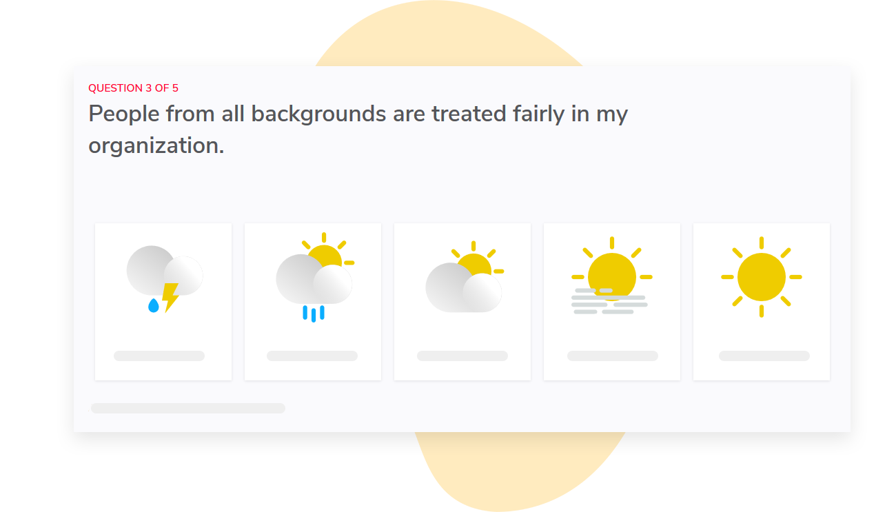
You can also easily compare the results across teams or departments to understand where you’re making progress in fostering an environment where people feel comfortable sharing feedback and where they’re more hesitant to speak up.
With the automatic report access aligned to your org hierarchy, you can ensure that each manager only sees results for their own teams while eliminating the tedious task of managing permissions manually.
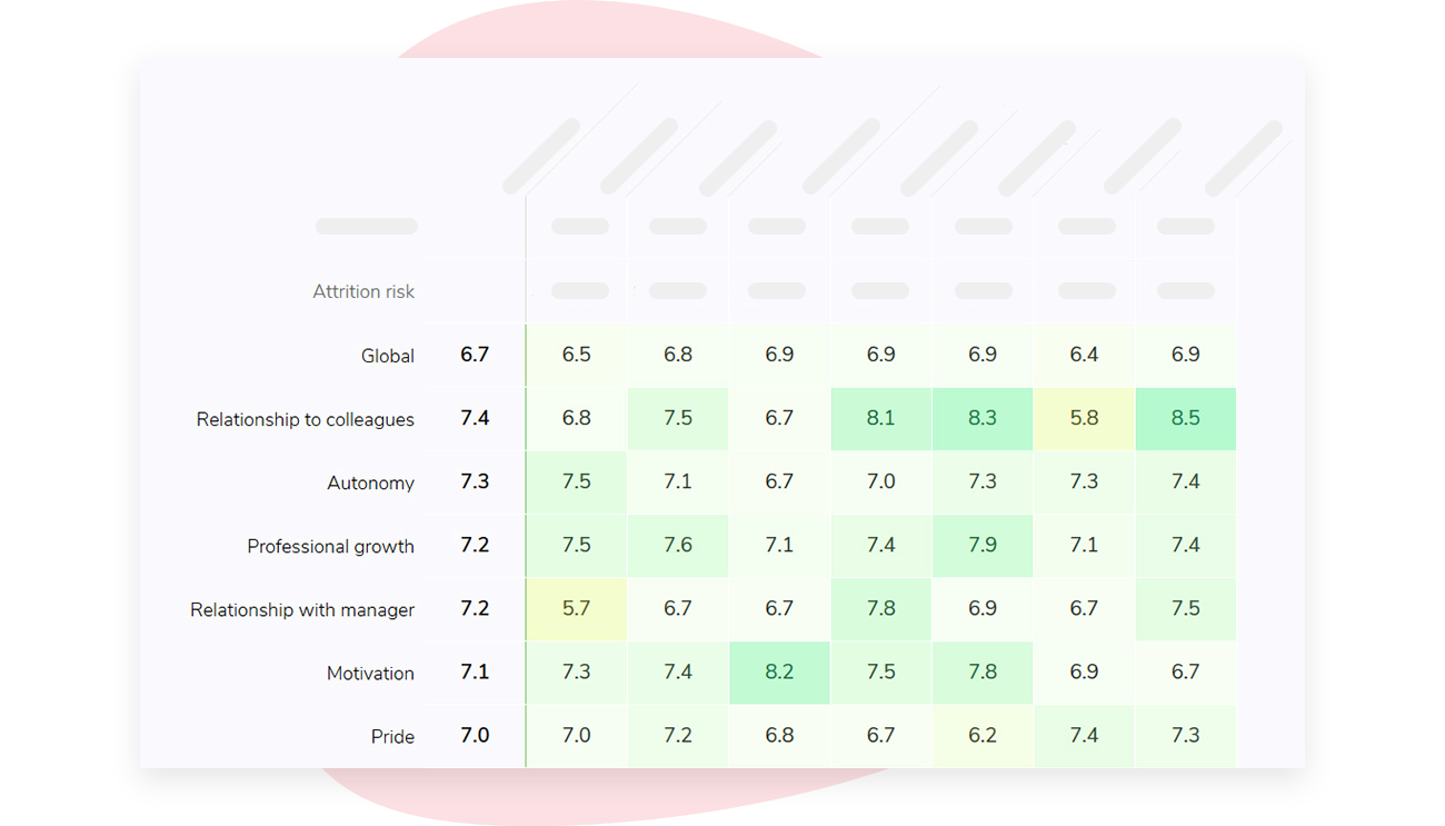
Similarly, small groups can be problematic. By default, Sparkbay hides results when fewer than 5 people respond, but you can adjust this minimum number.
Still, you’ll need to consider what comparisons make sense for your workforce, especially if combining small groups could lead to narrowed down identities of respondents.
If you’re interested in learning how Sparkbay can help you build a more engaged workforce, you can click here for a demo.
Connect the scores to costs without claiming too much
Choose the outcome by data quality, not by how compelling it sounds to executives. Voluntary turnover suits some pilots, but it lags by quarters. Defect rates or time to resolve a reported issue may move sooner and be recorded more consistently.
Match your measurement windows to the expected lags. Safety may shift within a quarter of a visible change in manager behaviour. Feedback quality typically needs a few cycles of real work to register.
Turnover can take a year or more. A single post-measure taken three months in will almost always show safety moving and the outcome flat. That is what the chain predicts, not evidence that the chain has failed.
For new hires, define "up to speed" locally before you measure it, for example as the time until they complete a specified task without extra support. Without that definition, each manager will use their own and the metric will drift.
Only a minority of workers strongly agree that the feedback they receive helps them do better work, according to Gallup research. Treat that as a reason to measure your own baseline.
Take a baseline for both the survey answers and the outcome. Roll out the manager coaching or other change, then measure again using identical items and outcome definitions. Rewording an item between waves breaks the comparison.
Before the first wave, agree a decision rule with finance. For example: scale the programme if the pilot beats the comparison group on feedback quality and the outcome moves in the same direction. Stop if neither moves.
Written down in advance, the rule stops anyone reading the results backwards once the numbers arrive.
Here’s a hypothetical turnover example. A pilot group of 200 employees had 20 voluntary departures before the change and 16 during a comparable period afterwards. A similar group without the change went from 20 to 18.
You wouldn’t count all four fewer departures as a return from the pilot. The comparison group improved too, so the difference-in-differences is two departures.
Suppose your finance team estimates that each avoided departure saves 15,000 in your local currency, and the pilot cost 20,000. On those assumptions, the estimated benefit is 30,000. Subtract the 20,000 cost, then divide the 10,000 net benefit by that cost.
The estimated ROI is 50%.
Now the uncomfortable part. At these volumes, a swing of two departures is well within normal year-to-year variation. One extra resignation in the pilot group cuts the estimated benefit to 15,000 and the ROI turns negative.
Show finance that sensitivity yourself before someone else works it out.
A break-even framing often lands better than a point estimate. Here, dividing the 20,000 cost by the 15,000 saving per departure puts break-even at roughly 1.3 avoided departures, so the pilot pays for itself if it prevents two or more. You then ask finance a simpler question: is that plausible, given what exit data says about why people in this group leave?
Every amount in that example is hypothetical. Your replacement-cost figure should include only costs you can defend line by line. Also confirm that the two groups faced similar hiring markets, restructuring and manager churn over the period.
A staggered rollout strengthens the comparison. Each wave serves as a control for the next, provided you record when each team starts. If managers volunteered for the early waves, though, you’re comparing motivated managers with everyone else, and that selection effect can explain most of the gap.
Watch for regression to the mean as well. If you chose pilot teams because they scored worst, some improvement is statistically likely without any intervention. The fix is a comparison group drawn from similarly low-scoring teams.
Then check the sequence. Did safety move first? Did feedback become clearer or faster next?
Did the outcome shift later? If only the final number moved, you have little basis for crediting the feedback work, however good the ROI looks.
The reverse pattern is informative too. If safety and feedback quality both improved and the outcome didn’t move, the feedback work may be sound and the outcome may simply be driven by something else, such as pay or workload. That is a different budget conversation from "the training didn’t work".
Gallup research suggests that many employees who leave voluntarily say their manager or organisation could have done something to keep them. That makes some turnover addressable, not all of it, and exits usually have more than one cause.
Don’t turn your measure into another feedback problem
Avoid putting team safety scores into manager objectives, bonus criteria or calibration discussions. Otherwise, you risk managers coaching teams to give better results before surveys or biasing scores upward at the expense of candor.
Keep an eye on response rates by team, in addition to monitoring your safety scores. If a response rate decreases for teams that previously had a low score, there’s a good chance that the remaining respondents are the more positive ones. Your score goes up because the unhappy people stopped answering.
Offer your managers a chance to discuss what the results mean. Receiving a low score is not fun, and it’s often a helpful prompt to ask what happened. That said, the best follow-up might be a facilitated team conversation that the manager does not lead.
Ask yourself whether your questions translate appropriately across all your regions. For example, the phrase "speaking up" may mean something for a team member to openly challenge their manager during a meeting, but it may mean sending a private message to their team lead afterwards for another group. You may want to adjust the wording to keep the underlying behaviour consistent and you’ll want to keep track of those changes so you can factor them into your analysis.
Is a monthly pulse too frequent? Can you do it quarterly? If you’re monitoring a pilot project that’s changing quickly, a monthly pulse might be appropriate.
But if there isn’t a lot to report or news to share between surveys, repeated waves can teach your teams that nothing changes as a result of your surveys.
Keep in mind that the number of engaged employees in the US, according to this Gallup research, is about one in three. Your team, or team-level variance, will provide more insight into where you really need to start projects.
If you ask teams whether they feel safe to be candid, be sure to share what you’ve heard and what you’re changing within weeks, not months. Your pulse survey itself may be a litmus test for whether people feel safe to be candid.
If you’re interested in learning how Sparkbay can help you build a more engaged workforce, you can click here for a demo.