
It’s possible that you’ll have 3 people leave one high performing team in a given quarter, and the company’s engagement score still looks good.
Let’s say your customer support team is doing pretty well. They’re hitting their targets, they’re successfully onboarding new team members, and they rarely escalate issues to you.
Then, out of the blue, you notice that three experienced members of your team have left. Their last two pulse survey results showed a decrease in how they felt about their workload or support from their manager, but given the size of the team, it hasn’t had a huge impact on your overall average engagement score.
In reality, you have both halves of the story. You have the survey results that tell you what your employees said before they left. And you have the exit records that show what happened after.
But these two halves rarely come together. They exist in different systems, use different team definitions, and are managed by different people within the organization.
When you bring these data sources together, on a team by team basis, you can accomplish a few things. You can determine where falling engagement scores lead to resignations, and where teams are experiencing turnover despite high engagement scores.
This second insight is just as important as the first. It prevents you from treating every turnover event as an employee engagement issue and plugging your retention budget into things that won’t work.
Connecting engagement drivers to retention risk across the org hierarchy
- The averaging trap
- What do your scores mean?
- Carefully match your survey results to turnover data
- Choose an analysis that fits the data
- Identify where your teams fall on the heat map and address specific areas
- How Sparkbay can help you identify team-level retention risks
- Don’t overstate the manager’s role
- Check whether the response worked
The averaging trap
Suppose your company scores a 7.5/10 on employee engagement.
One of your teams scores a 4.5, another scores a 9.2.
If the larger team is scoring well, you may not realize sooner than you should that the smaller team is heading towards trouble.
The less obvious trap is that you think everything is fine, because your average engagement score has gone up.
What you don’t realize is that your average went up because people left the company.
Suppose your teams experience an uptick in turnover over the same time period that their engagement scores rise. Consider the rising engagement score a composition effect until you can verify a real recovery.
For example, to check for a real recovery, you might look to see if engagement items for which there was a previous drop score an improvement, or if the people who previously provided low scores are simply no longer with the company.
Why is it a good idea to focus on the team level for retention work?
Because the team level is where someone shares a manager, a workload, and a set of career options.
This limits some of the noise of data at the company level. At the same time, you still have to be cautious about noise at the team level. In a team of 8, for example, one person’s mood can significantly impact average scores, so it’s hard to draw meaningful insights from a single survey.
What does the research say about getting below the company level?
Business-unit level research done by Gallup has found that highly engaged business units have noticeably less turnover than less engaged business units across a number of industries and workplaces.
It’s important to note that understanding the relationship at the business unit level doesn’t mean you can assume there is a "this low scorer will quit" relationship. That would be an ecological fallacy, and the fastest way to lose the trust of the employees you’re trying to keep.
Plus, just because an employee is on a low scoring team, it doesn’t necessarily mean they’ll quit. They may be on a high scoring team, but leave for a competitor with better pay or a role they can’t get at your company.
Focus on comparing your teams to similar teams before comparing them to the whole company.
For instance, a support team that works on rotating shifts will have a structurally higher baseline for lower engagement scores and higher turnover than a small group of senior specialists.
It’s worth benchmarking against teams with the same roles within the organization.
What do your scores mean?
At this point, you should have a general idea of where you have problems based on your overall score, and what those problems are based on your sub-items.
For example, an item on recognition, growth, workload, belonging, and manager support can fluctuate in the positive or negative direction within one team. You may notice that your overall score is decreasing and worry about the impact this has on retention. However, once you look at the sub-items, you realize that only one of your sub-items has drastically decreased while the others are stable.
This is larger than the normal fluctuation for this team. This may be a sign that you need to focus on one particular area.
In smaller teams, it is often helpful to consider the change in scores over 2-3 survey rounds rather than evaluating the scores on their own. This could be beneficial when you decide to test the relationship between survey scores and exit data down the line.
It is also worth noting that employee satisfaction and employee intent to stay in their jobs are not the same thing. An employee may be satisfied with their job, for instance, because they like their coworkers, but they may plan to leave for a promotion. Another employee may be less than satisfied with their job, but plan to stay for now due to their mortgage, visa status, or the lack of job opportunities in their area.
Which questions do you want to pay the most attention to?
Certainly identify those questions that refer to staying with the company, ask employees about their growth, and whether they believe that reported problems are addressed. Then, once you have this data, ensure you conduct a proper analysis of its relationship to exit data. In other words, don’t simply assume that if employees answer negatively to these questions there will be a corresponding employee exit.
Research on turnover intentions shows that while people who say they want to leave their jobs are more likely to actually leave, there are also many people who say they want to leave but don’t. This means that you shouldn’t view stated intent as a definite forecast.
Some employees won’t be reflected in your survey results at all. According to Lee and Mitchell’s unfolding model of turnover, some employees will leave because of a "shock" - an unsolicited job offer, a partner’s relocation, or the announcement of a reorganization. These employees may leave a team that has healthy survey scores overall.
This is something to keep in mind so that you don’t view these exits as further proof that your survey is useless.
Even if your survey doesn’t include questions about pay, you should consider including it at some point in your exit survey analysis. Pew Research Center found that low pay and limited opportunities for advancement were the two most commonly cited reasons workers quit, with 63% of workers who quit in 2021 citing each. Excluding pay position information from your engagement survey exit analyses could lead you to blame engagement for exits that are really about pay, and to spend your engagement program on the wrong problem.
But wait, isn’t pay the real issue? Why should I focus on things like growth and recognition? As Leigh Branham argues in his book The 7 Hidden Reasons Employees Leave, it’s important for organizations to realize that while money may be the most popular answer for people when asked why they’re leaving, in reality, most of these individuals are actually upset with issues they can do something about as an organization. Inaccurate job descriptions, lack of coaching, a lack of visible opportunities within the organization, not feeling recognized, feelings of overload, or lack of trust in senior leaders are all issues that Branham identified in his exit interviews. So while employees are cashing their paychecks on the way out the door, it’s important for organizations to identify the real reasons they start looking in the first place. This is also why it’s important for organizations to want to measure their pay position directly, rather than just relying on the exit survey data.
Finally, you’ll want to avoid changing the survey questions every time you receive a less than desirable score. This disrupts your trend lines and makes it difficult to have the historical view you need to connect survey scores to exit survey data. You’ll want to keep your satisfaction survey questions mostly the same for long enough to see if there’s a real shift in your results.
That said, if there’s something specific you want to test - for example, whether employees feel like they have a path to the next role - you can also add item to your survey.
Carefully match your survey results to turnover data
At a high level, this step involves matching two data points: a team’s survey results at a particular date and the number of voluntary exits from that team following that date. Nevertheless, errors can crop up at several points, so it’s important to pay attention and take a methodical approach.
First, ensure you’ve correctly defined your teams by using an effective-dated snapshot of your organizational hierarchy at the survey close date, rather than your current organizational chart. For instance, if a manager took over a team halfway through the lookback period, you’ll want to associate that team’s earlier survey responses with the prior organizational structure.
On a related note, decide in advance how you’ll handle teams that were merged or split. You don’t want to interpret a "trend" that’s actually just the result of a change in headcount due to your reorganization. It’s much easier to defend a decision when it’s documented ahead of time, rather than being questioned in the wake of observing survey data.
Second, consider how you’ll count turnover. Will you only consider voluntary resignations? What about layoffs or dismissals?
Will you consider internal transfers from the team to other teams as exits?
If you’re conducting a retention analysis, you may want to create a separate category for internal transfers. It’s a different proposition if a team is losing its talent to the rest of the business compared to if it’s losing its talent to competitors. You don’t want to punish managers who are helping to develop their people by lumping internal transfers with external exits.
If you’re using a regrettable-loss flag, be mindful of the criteria used to apply that flag. If managers apply this flag after an employee submits their resignation, there may be a hindsight bias. Additionally, remember that a role that’s difficult to replace isn’t the only role that matters.
As you calculate your exit rate, ensure you’re considering the size of the team. For example, if there are 3 exits over a given period in a team of 12, that’s very different from 3 exits in a team of 120. It will give you different insights.
Calculating the exit rate by dividing the number of exits over the period by the average headcount over the period is a smart approach. If your lookback periods differ from a year, consider calculating annualized exit rates.
As you conduct this analysis, match survey results to subsequent exit rates. For instance, you might look at exit data over the 6 months following a particular survey date, then conduct a similar analysis looking at exit rates over 12 months. If your relationships only show themselves at a certain lookback period, they may not be robust enough to warrant action.
Pay attention to the immediate period that falls within your lookback window. There are times when employees are more likely to resign, such as immediately following a bonus payout or annual pay reviews, since they want to receive their bonus before they go. If your 6-month lookback includes 3 months before the bonus payout and 3 months after, you’ll likely see a different trend (and one that’s unrelated to employee engagement) than if your 6-month lookback only captured the months after the payout.
Once you understand your typical turnover rates, you can start to interpret your turnover data. At an annual turnover rate of around 10%, most teams of 10 or 15 people will experience zero or one exits during a 6-month time frame. As a working rule of thumb, you know you’re looking at anecdotal data if a team or group experiences fewer than about 5 exits within the lookback timeframe.
To draw meaningful conclusions, you may want to aggregate several rounds of surveys or group teams together by role family, rather than forcing a team-level conclusion that the data can’t support.
Keep in mind, you don’t need to manually link survey results to turnover data. You can aggregate survey results with a properly defined team definition, combine those results with team-level exit counts, and then apply a minimum response threshold before assigning a survey result to a team.
When presenting combined survey and turnover results, be sure that minimum threshold criteria are met within the combined report as well. You don’t want survey results that were filtered out due to low numbers to be reintroduced by filtering on location or through comparisons to other dates. Similarly, you don’t want someone to be able to identify a person based on a single exit in a tiny group combined with their exit reason.
Keep in mind that turnover costs 50% to 200% of a worker’s annual salary when you consider costs like hiring and ramp-up time. SHRM’s work on the cost of turnover is a helpful reminder that headcount alone doesn’t capture the real impact an employee’s exit can have.
It’s also useful to cost out turnover to individual teams within your organization. A resignation in a role with a long ramp-up time or a role that requires a scarce skill set is a lot more expensive than a role you can fill in a matter of weeks.
Choose an analysis that fits the data
You don’t need a prediction model to find a useful pattern. Start by plotting each team’s engagement score against its later voluntary turnover rate, with point size showing headcount so tiny teams don’t dominate the eye.
Do lower-scoring teams tend to lose more people? If so, repeat the comparison across several survey periods. One unusual quarter produces a tidy chart that falls apart the next time you run it.
Then group teams into score bands and compare turnover per band. A correlation coefficient tells you a relationship exists; bands tell you where it bites.
Many organizations find turnover roughly flat across the upper bands and climbing below a certain point. If yours looks like that, the band where it climbs is your alert threshold, and it is a far better one than an arbitrary red-amber-green cutoff copied from a benchmark.
Correlation is a starting point. The next step is a lagged comparison: put a team’s survey result beside its exits in the period that follows, not beside exits that already happened.
That order matters. Resignations hurt the scores of the people left behind, because they absorb the workload and watch colleagues go. Compare scores and exits from the same month and you can’t tell which came first.
Regression helps once you have enough teams and periods to compare like with like. Include factors that plausibly drive both scores and exits, such as role group, location, tenure mix and pay position, and see whether the engagement relationship survives.
Employees sit within teams and teams within units, so ask whether your analysts account for that nesting. Ignoring it makes results look more certain than they are.
Don’t add every field in your HR system just because it’s there. A model with few exits and many inputs fits history beautifully and makes poor calls going forward.
Ask your people analytics team to show how the model performs on a later period it wasn’t built on. If they can’t, treat it as exploratory, not as something to plan headcount around.
Judge it against the right baseline, too. With 10% turnover, a model that predicts "nobody leaves" is right 90% of the time and useless. Ask how well it ranks teams by later exits, not how often it’s "accurate".
Survival analysis answers a different question: how long until an exit, while correctly handling employees who are still with you when the study ends. A competing-risks version also treats voluntary exits, dismissals and internal moves as competing outcomes rather than lumping them together.
It needs careful rules for who enters the study and when. More importantly, it needs a clear privacy case.
A model that estimates an individual’s chance of leaving is not a team-level planning report. Under GDPR it is profiling, which in practice means a data protection impact assessment, and in countries with co-determination rules it brings the works council in before it goes live. A team report built on anonymous aggregates sits in a much lighter category; keep the two separate in your governance.
As Donald T. Campbell and Julian C. Stanley argue in Experimental and Quasi-Experimental Designs for Research, a comparison only earns trust once you’ve worked through the rival explanations for the result. They catalogue these as threats such as "history" (something else happened at the same time), "instrumentation" (the measure changed), regression towards the mean and "mortality" (people dropping out of the group being measured).
Each one has an HR equivalent. History is the manager change, reorg, pay review or competitor opening nearby in the same window. Instrumentation is the reworded survey item.
Mortality is the composition effect from the first section: leavers taking their low scores with them.
Run through that list before crediting a team’s survey score with predicting its exits.
Identify where your teams fall on the heat map and address specific areas
You’ve created your heat map, with engagement on one axis and anticipated voluntary turnover on the other. You’ve used your own historical data to determine the cutoff points between high and low engagement and high and low predicted turnover, and you’ve listed the number of employees and responses to your survey that make up each data point.
Now that you’ve mapped your teams on this heat map, it’s important to understand what your different teams may need based on their placement on the map. Your teams may fall into four different quadrants on this heat map, and you’ll want to use this qualitative graph to focus on different questions for each quadrant.
If your teams fall into the high engagement and low turnover quadrant, this is what you’d expect and hope to see. These teams are engaged, and based on your historical data, you don’t expect them to leave. It can be helpful to understand what these teams do well.
That said, don’t assume that it’s one specific managerial practice that’s keeping these teams engaged. It may also be the case that these individuals work in roles where the external market is not actively recruiting them away at the moment. This would make voluntary turnover less likely regardless of the team’s management.
If your teams fall into the low engagement and low turnover quadrant, you may not be sure whether you should be worried. Low engagement is a problem, but since this team isn’t experiencing much turnover, it may feel like there isn’t an issue. Understanding research on job embeddedness (or "stickiness") can help team leaders understand this phenomenon.
Job embeddedness, a concept associated with researchers like Terence Mitchell and Thomas Lee, refers to how well employees feel linked to the place they work. These individuals may have tenure-linked benefits, be heavily connected to the community through their job, and possess skills that aren’t easily transferable to other roles, which keeps them in place even if they’re less than satisfied with the current job.
If this is the case, your organization will experience turnover when these factors change-when the external job market shifts or when a new competitor opens up nearby that starts recruiting. Taking employee suggestions from stay interviews and understanding questions that were answered poorly on the engagement survey can give you a head start on addressing these issues before you experience a turnover event.
If your teams fall into the high engagement and high turnover quadrant, it’s time to dig deeper. This team is engaged, but they’re turning over at a high rate. Take a closer look at how your pay compares to the market, and whether there are career path opportunities available for employees.
You’ll also want to investigate whether competitors are recruiting for these employees’ skills.
Plus, there may be planned turnover happening in these teams. For example, some graduate programs have rotation programs or teams may routinely promote people into other roles. Analyzing exit interviews may help you evaluate internal moves versus actual departures.
Researchers at MIT Sloan have found that workplace culture has a strong relationship with employee attrition, when analysing employee reviews. While culture isn’t the only reason people leave, your high turnover teams may fall into this quadrant for other reasons.
If your teams fall into the low engagement and high turnover quadrant, this is the area that needs the most urgent attention. Use your engagement survey data, specific item-level trends, and exit interview themes to understand what may be causing turnover. It can also be helpful to loop in the manager of this team to better understand the situation.
Even though you’ve typed your team into the "low engagement, high turnover" group, it’s important to ask the remaining employees what they would like to see changed. They’re potentially the team of people you can still hold on to.
Remember that if you have a very small team with very few employees, even a couple of turnovers in a period of time could cause you to move from one quadrant to another. To avoid overreacting, you’ll want to flag these data points as unstable before drawing any real conclusions from the color on the heat map.
Similarly, if your team moves into a different category, you’ll want to wait until you’ve observed two consecutive survey periods before moving them into a different response category.
How Sparkbay can help you identify team-level retention risks
Sparkbay tracks engagement as a score out of 10, so you can easily identify when a team’s score starts to fall between company-wide surveys.
You can customize the wording of your surveys to ask questions tailored to your teams’ real issues and customize the wording and content of the dashboards to answer the questions your leaders have.
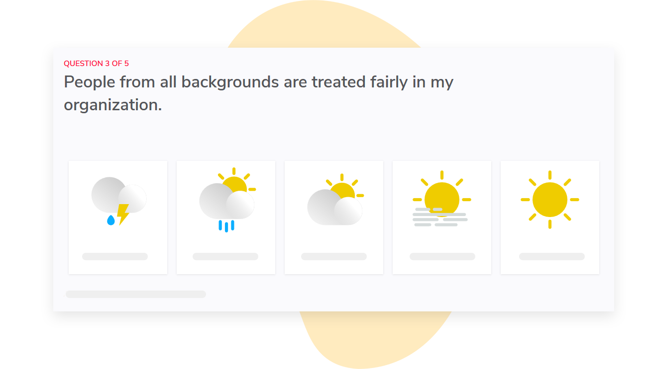
Once you’ve identified a trend, you can compare teams using our heat map. You can then compare these results to the exit data you track.
Access to reports is automatically mapped to your org hierarchy, so managers only see survey results for their teams and not others.
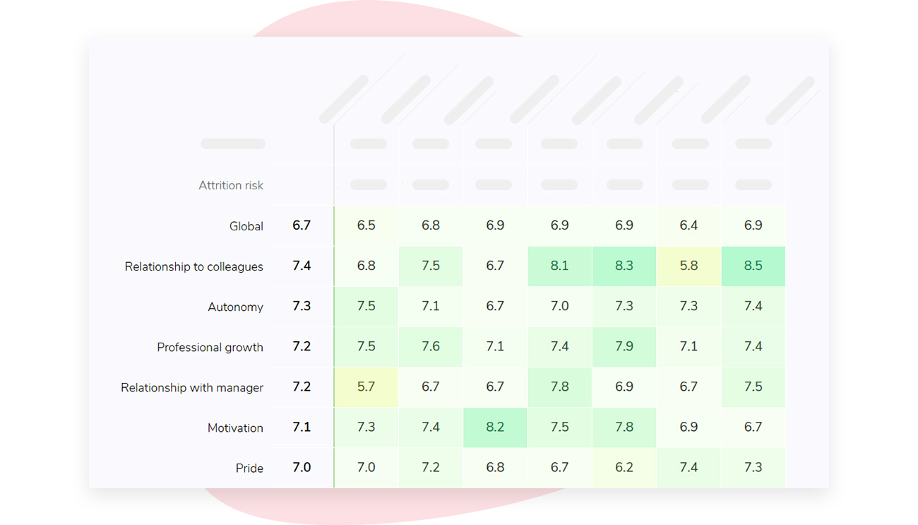
Sparkbay hides survey results if the number of responses doesn’t meet a minimum threshold (5 by default) to protect the privacy of your employees. That minimum can be raised for your account. We recommend applying the same privacy standards to the turnover reports you use alongside survey results.
If you’re interested in learning how Sparkbay can help you build a more engaged workforce, you can click here for a demo.
Don’t overstate the manager’s role
Managers have a big impact on what survey questions measure day to day, such as setting priorities, providing feedback, and creating opportunities for growth for employees.
Through large-scale research across business units, Gallup has determined that managers account for more than half of the difference in employee engagement levels between teams.
On the other hand, a manager can’t do anything about your teams’ pay range or the number of available promotions. If multiple teams, under different managers, report an issue in these areas, it’s a signal that leadership needs to address that topic.
A simple method to determine if an issue is managerial or policy related is to ask yourself, "If a manager moved to a new team, would this issue move with them? If yes, then it’s a managerial issue. If no, then it’s likely a policy issue or another issue related to the work itself."
You may also want to compare manager-related survey questions to other survey questions, such as, "I am satisfied with my opportunities to grow in this organization" or "I am able to complete my work within my allotted hours." If employees report a low level of support from their manager, but their team also reports that they’re not able to manage the volume of work they have, it’s possible their manager is overwhelmed with too much on their plate and unable to support their team effectively.
Similarly, pay attention to survey responses from teams that have recently experienced a managerial change. Your new manager inherits the legacy of the previous manager, so avoid re-evaluating a manager based on employee feedback from their first two months on the job.
Survey results should be used to help managers facilitate conversations, not to rank managers. It’s unlikely managers have ever received training on how to react to survey feedback. Present them with trends from their team’s survey responses and coach them on how to identify one area for improvement that they can work on.
Schedule a follow-up conversation to check progress.
While it’s tempting to roll out a manager scorecard, this presents challenges. Once managers receive a score, they have every incentive to challenge the validity of the ranking or to coach their team on how to answer survey questions. This creates a disincentive for managers to focus on real issues raised by their team members.
This also creates challenges for your team. If managers coach teams, it impacts the quality of your data.
Check whether the response worked
What do you do if you find your team’s employee satisfaction scores are low and your turnover rates are rising?
First, ask your employees. A stay interview can help you assess whether your satisfaction survey results have identified the right problems. Ask open-ended questions, look for themes within your team, and emphasize that while this one-to-one conversation isn’t anonymous, it offers an opportunity to be honest.
If your employees state that their workload is the problem, take a look at how many open positions you have, how much overtime employees are working, and whether there are experienced employees who are picking up the slack. Coming up with a recognition program is not going to help an overburdened team. In fact, they may view it as a sign you weren’t listening.
If people say they can’t see a path for growth, show them real job openings and the skills required for those roles. Avoid asking managers to promise promotions that don’t exist.
Write down what you will be changing and when. Then chart the survey questions related to that change, as well as voluntary exit numbers, over your next time period.
You may see changes in your satisfaction scores before you see changes in your turnover rates, especially if you have a small team. Decide how long you are willing to wait before re-evaluating your response, and write that success criterion down before your next round of surveys are completed.
Keep in mind that your satisfaction scores may improve between survey rounds no matter what you do. On average, teams that receive the lowest scores tend to receive higher scores the next round due to regression towards the mean. To evaluate the impact of your response, compare your "response" teams to similar low-scoring teams that you have not yet intervened with, instead of comparing them to their previous satisfaction scores.
Do you know which issue your team raised? Do you know who is responsible for implementing changes? Do your employees know when they’ll hear an update on what happened?
If you can’t answer all of the above questions, you’re not ready to distribute your follow-up. Asking your team for feedback and failing to act on it is a fast way to damage the trust you need for your next survey.
Protect trust in the data
Team analysis sharpens your view of risk, but a small slice of data can still point back to a person. Set rules for response thresholds, filters and who sees each report before anything is shared, not after someone notices a problem.
Treat participation as data in its own right. When the employees under the most strain stop answering, a rising score says more about who responded than about the work.
Compare response rates across rounds before you celebrate a change. A team whose participation drops sharply is telling you something the score can’t, and in a team that is also losing people, a falling response rate is one of the earliest warnings you get.
Be clear about what the analysis can’t prove. Low engagement can come before resignations without causing them. A new manager, a pay change or a shift in the work can drive both.
Start with one business unit where team definitions have been stable and there are enough exits to compare across time.
If you’re interested in learning how Sparkbay can help you build a more engaged workforce, you can click here for a demo.