
An employee engagement score of 7.2 doesn't mean much on its own.
The CHRO puts the number on the boardroom screen, one director nods in approval, another asks if the company should be worried.
But should they?
It depends on what items were included in the index, how the company converted responses on a 5-point agreement scale to a 0-to-10 number, and how we decided on the final answer.
Plus, did all parts of the engagement score carry equal weight? And if so, why?
Despite this, engagement scores are often reported like revenue figures that have been audited and finalized.
In reality, very few people in the room would be able to re-construct the engagement score calculation if asked to do so. This is a dangerous place to be if you're asked to defend it by a director.
If you're an HR leader, you need more than a number that looks good on paper.
How the score out of 10 is computed, how eNPS differs, and how to read your team's number
- What a 7.2 actually means
- What are the 4 pillars behind an engagement score?
- Turning survey answers into numbers
- The employee engagement formula
- How to choose the weights
- How an out-of-10 score differs from eNPS and favorability
- Sample size, anonymity and response bias
- Is 7 a good engagement score?
- 5 ways companies unintentionally inflate their engagement score
- Move from the score to its drivers
What a 7.2 actually means
Since you're aware that engagement isn't the same as satisfaction, you understand the importance of a), using the right questions to measure each variable, and b), understanding how different variables behave survey-method-wise.
This is important, because satisfaction survey questions behave like state measures and fluctuate like the weather.
On the other hand, questions that measure items like advocacy and intent behave more like attitudes.
When these various questionnaire items are combined to create one engagement scale, your data trends may be influenced by the weather.
A 7.2 or a 6.5 or 8.2 engagement score out of 10 is NOT the answer to one question on the survey. It's a composite index.
Since engagement is a latent construct (engagement itself is not observable), it's measured through indicators such as pride, advocacy and intent to stay. Each of these indicators introduces measurement error.
Why is this an issue? Because it means your survey data contains measurement error and potentially less reliable data.
To counteract their unreliability, you want several survey items. As Robert F. DeVellis explains in his book, Scale Development, combining several well-designed items allows the idiosyncratic "noise" in any one question to cancel out, on average.
Conversely, if you only used one question to measure engagement, all the variance tied to that question would influence the overall score. This variance could be tied to the wording of the question, for instance, which may confuse respondents one way or another.
So what does a 7.2 mean?
It means that the weighted average responses to the survey questions on the engagement metrics is equal to 7.2 once the platform has put these weighted average scale responses on the same standard 0 to 10 scale.
A 7.2 does NOT mean 72% of employees are engaged.
Likewise, it's not a B grade.
This is important because one person may interpret a 7.2 as a 72% score while another may interpret it as a B grade. This can cause problems when you're trying to translate this score into something more intuitive for a board presentation.
So how do you explain this in one sentence to a director or someone who wants an intuitive explanation?
You could say that it is the weighted average of the position employees selected (on average) for our questions on engagement.
What are the 4 pillars behind an engagement score?
Let's rewind a little. As we've already mentioned, there's no such thing as a universal engagement model. Be wary of vendors that say otherwise.
They're likely trying to sell you their pre-made questionnaire.
That said, most defensible engagement models focus on 4 key outcomes/elements. These are: Employees speaking positively about their employer, feeling a connection between their work and a larger sense of purpose, applying discretionary effort, and wanting to stay at the organization.
In some instances, these pillars are referred to as "Say, Stay, Strive." And in other instances, the sense of purpose is included in the pride element. This is up to your company's discretion, but keep in mind this will change the weighting given to each pillar.
| Pillar | What it measures | Sample survey item |
|---|---|---|
| Advocacy | Whether employees would speak well of the organization | I would recommend this organization as a good place to work. |
| Pride and purpose | Whether employees value the organization's work and their part in it | I understand how my work contributes to our goals. |
| Effort and ownership | Whether employees feel willing and able to go above and beyond | This organization motivates me to do my best work. |
| Retention intent | Whether employees expect to remain with the organization | I see myself working here 12 months from now. |
At this point, you might be wondering how the "sample survey items" fit into the overarching engagement survey. Do they impact our overall score?
Yes, but there are other factors that impact your engagement score more than your weighting scheme does.
For example, the survey item "I always work harder than expected" is extremely prone to distortions based on workload pressure and social desirability. If you're an understaffed department, this number will go up as things get worse, potentially impacting your overall engagement score in ways that don't make sense.
The same applies to items that relate to happiness in a workplace. These items are prone to externalizing factors based on mood, seasonality, and what's going on in the two weeks before the survey launches.
Similarly, companies should be mindful of double-barreled items (e.g., "my manager supports me and gives me useful feedback"). It's difficult for employees to answer these if only one part is true for them.
Companies should also be careful when using reverse-coded items to eliminate acquidessness. These items often form separate factors which can negatively impact the dimension they're in.
Gallup's meta-analytic work shows that well-constructed employee engagement measures, including those in the areas above, are correlated with important business outcomes like turnover, absenteeism, safety, and productivity across a large number of workplaces.
That said, this doesn't mean you can automatically add any of the meta-analysis items to your engagement survey.
Before adding an engagement survey item to your overall instrument, ensure it's aligned with your needs. What is it gonna measure? What decision will this help you make?
Which function will be responsible for using the data from this survey item to make changes?
In other words: If there's no team to own the implementation of a change based on this data, then there's no point in adding it.
Here's a specific example to consider: Retention intent is one of the most relevant business-related pillars of engagement survey. But it also is a very noisy metric that is impacted by the external labor market as well as workplace conditions.
If the external hiring market freezes up, your retention intent may increase across the board, giving a false impression of improvement in your overall engagement index.
Turning survey answers into numbers
Most engagement surveys use a 5-point or 7-point agreement scale.
Choosing which scale to use has an impact on how your scores are distributed. 7-point scales allow for a better distribution of scores and reduce ceiling effects experienced when using 5-point scales (scoring from 1 to 5, the scale only feels limited once your average responses start to get above 4.2 or so). Another option is to use 0-to-10 scale survey items to allow respondents to more directly rate their responses.
Once you've gathered data from multiple scales, it's important to normalize your scales before performing combined statistical analyses.
If your scale's lowest possible response is 1, use this formula to convert your scores into a score out of 10.
Score out of 10 = ((average response - 1) / (length scale - 1)) x 10
Suppose your employees average an average response of 4.1 for one 5-point scale survey question.
You would plug this value into the formula as follows:
((4.1 - 1) / (5 - 1)) x 10
This works out to:
3.1 / 4 x 10 = 7.75
Your normalized score for that survey question would be 7.75 out of 10.
On the other hand, an average response of 3 on a 5-point scale would be 5 out of 10, since 3 is the midpoint of the scale. Using the simple division method, you would get a 6 out of 10 (since 3/5 = 60%) which isn't quite right.
This simple division method assumes that the scale starts at 0 instead of 1, introducing an upward bias in all scores. This bias is inflated further at the low end of the scale where there's a bigger difference between numbers.
This is a very common mistake in custom-made, homegrown data dashboards.
For 0-to-10 survey items, no conversion is needed. For 1-to-7 scale survey items, you would use 7 as the maximum value.
It's also important that "not applicable" and "don't know" options are not factored into the mean calculation. They shouldn't be recoded to the midpoint value since this would artificially create mild agreement and skew all our scores closer to 5.
A quick note: this linear rescaling assumes equal psychological distance between points on the scale. There's a debate in the survey community about whether to treat ordinal Likert scale data as interval data. While the purist view (favorability, or using ordinal models) is valid, the pragmatic approach (used for the most part in enterprise reporting) is to treat it as interval.
The employee engagement formula
Once you have all of your questions on the same scale, and you've calculated the mean for each dimension, it's time to calculate your total engagement score.
Recall that you have to apply weights to each dimension using the formula:
Engagement score = Σ (dimension score × dimension weight) ÷ Σ weights
Typically, if your weights add up to 100%, then the denominator becomes 1 and you can ignore it.
Let's consider an example. Suppose the fictional company Northbridge Logistics has completed a survey with 412 valid responses.
For simplicity's sake, let's assume that the company has used a 5-point scale for agreement and that the 4 dimensions are weighted unequally.
| Dimension | Raw average | Score out of 10 | Weight | Weighted result |
|---|---|---|---|---|
| Advocacy | 3.96 | 7.4 | 30% | 2.220 |
| Pride and purpose | 4.12 | 7.8 | 25% | 1.950 |
| Effort and ownership | 3.84 | 7.1 | 25% | 1.775 |
| Retention intent | 3.64 | 6.6 | 20% | 1.320 |
Overall, the engagement index is:
(7.4 × 0.30) + (7.8 × 0.25) + (7.1 × 0.25) + (6.6 × 0.20)
Which equals:
2.220 + 1.950 + 1.775 + 1.320 = 7.265
Northbridge Logistics engagement index is 7.3 (rounded to 1 decimal place).
(You should only round off numbers once at the end of your calculation. Otherwise you run the risk of HR and analytics presenting two different numbers for the same survey within the same week!)
In the above table we've made an implicit modelling choice. Did we choose to find the mean of each dimension's questions and then plug that number into our formula?
Or did we decide to find the mean of all the questions from all the dimensions?
This only makes a difference if you have different numbers of questions per dimension. (Remember, in our simple example we only had 4 dimensions.) Consider the impact of having a dimension with 2 questions versus a dimension with 5 questions. Using the former method, these will have equal weight in the overall index.
On the other hand, if you calculate the mean of all the questions, the 5-item dimension has a greater impact on the overall measure than the 2-item dimension.
Dimension-first scoring calculations are usually the most defensible way to proceed, as it makes the weighting explicit and not an accident of questionnaire length.
What about missing data? How should you account for skipped questions?
This is an important consideration that we recommend you put in writing. The engagement index will be calculated using an available-case scoring method where each dimension's score is calculated using the valid responses to that dimension's items.
Note that no skewed responses are considered a zero score. The trade-off is that respondents may contribute to different dimension scores.
You may also want to introduce a rule defining minimum completion in order to be included in the overall index score (e.g., must answer X% of core items). This should be decided before the survey is distributed and reported on afterwards (e.g., how many responses were excluded).
How to choose the weights
In general, an equal weighted index is easy to explain and hard to beat. Since dimensions are often correlated, giving each item an equal weight will often result in predictive ability similar to weights derived using an optimization procedure. Plus, equal weights don't have to be re-estimated every year.
This is the best we can do, in all honesty, without having outcome data that allows for a more sophisticated solution.
Why does Northbridge recommend assigning 30% weight to willingness to recommend? Because our survey model has been created with the belief that willingness to recommend is the clearest indication of an individual's level of engagement. This is a claim that can be debated, but the point is that there's a stated theory and business rationale behind the weighting.
Statistical methods can also be used to determine the best weighting.
One method is to regress an outcome (e.g., voluntary turnover) on employee experience/employer brand dimensions and then use the strength of these statistical relationships to determine weights.
This method has some important limitations. One limitation is overfitting. The weights created during one year and for one business unit may not reflect important changes brought on by a change in the labor market, a restructuring, or an acquisition.
Another potential problem is multicollinearity. For example, pride and advocacy may be strongly and positively correlated. This could make weights unstable, and cause the weighting to change signs.
You might have to explain to your executive team why pride is emphasized less this year compared to last.
Often, it's better to use a simple employee experience index that is more straightforward to present to leadership and is more stable over time.
A helpful exercise is to compare the results of an equally weighted index to the results of the weighted index. If the results differ by less than 0.1, the weighting is just window dressing and it's best to stick with the simpler version.
But if the difference is larger, that suggests a particular dimension is dominating the score, so a good (and not simply "more strategic") reason is needed for that heavy weighting.
Regarding reliability, roughly 0.70 is the common cut-off used by practitioners for group-level reporting although this is dependent on the level of confidence required in the survey results. It's interesting to note that Cronbach's alpha assumes that you can give equal weights to items and that there's a single dimension - so, if you create a multi-dimensional index, it's better to use coefficient omega or a confirmatory factor model to check reliability.
Moreover, an alpha that's too high isn't desirable either. For example, an alpha of 0.95 from five items may indicate that you asked the same question in five different ways, creating redundancy rather than covering more ground.
How an out-of-10 score differs from eNPS and favorability
Let's take a look at how the same responses can lead to different headlines.
| Method | Calculation | Typical range | What it preserves |
|---|---|---|---|
| Mean index | Average of normalized responses of selected items | 0 to 10 | Preserves entire response scale |
| Favorability | Percentage of positive responses | 0% to 100% | Preserves percentage of responses above a certain cut-off |
| eNPS | Percentage of promoters - Percentage of detractors | −100 to +100 | Preserves balance of two end groups |
Suppose you have 10 employees responding to a recommend question from 0 to 10 with the following answers: 10, 9, 9, 9, 8, 8, 7, 7, 6 and 5.
The mean of these responses would be 7.8.
Using standard eNPS categories, we'd have 4 promoters (40%), 2 detractors (20%), and 4 passives (40%).
This gives us an eNPS score of 20 (40% - 20% = 20).
Now suppose one of the employees who responded with an 8 decides to respond with a 9. The mean goes up slightly, by 0.1, but the eNPS score jumps 10 points. That small change in opinion has a big impact on the headline number because you cross a category boundary.
eNPS and favorability, which are categorical metrics, are hypersensitive at the cut-off points and insensitive everywhere else. This causes eNPS to jump dramatically in small teams (e.g., 15 people) and makes it difficult to interpret changes over time in small teams.
There's another issue with applying eNPS methodology in an international workforce. The same sentiment may lead to different eNPS scores based on how a culture responds to the extreme ends of a response scale.
Setting the promoter cut off at 9 may create the illusion of large international engagement differences when in fact the difference is the response style.
By incorporating all response options, an engagement score out of 10 is less susceptible to these rapid changes. It also allows analysts to generate a confidence interval around the score. For these reasons, Sparkbay prefers this engagement index as the main measure while presenting eNPS as a complementary approach.
At first sight, favorability avoids the cliff edge problem of eNPS by focusing on positive responses. But this shifts the cliff edge from the bottom of the scale to the middle of the scale. This makes a difference when a response changes from neutral to agree, but not when a response changes from agree to strongly agree.
Favorability also does not allow teams to see how polarized their responses are. Two teams may have the same favorability score, but one may have mostly 9s while the other is a mix of 4s and 9s.
A simple way to improve the usefulness of favorability and eNPS is to report additional statistics, like the standard deviation or the percentage of people who responded with the two lowest options, in addition to the team's overall score. A 6.8 overall score that is the result of consistent mild agreement is different from a 6.8 overall score where half the team responds with 9s and the other half responds with 4s.
Sample size, anonymity and response bias
You can plug your responses into the wrong formula and come up with the wrong answer.
In large workplace surveys, the response rate varies. You can generally expect anywhere from two-thirds to four-fifths of your workforce to participate. Nevertheless, the response rate is not an accurate indicator of how representative the responses are.
For instance, you may have a 70% response rate, but only a 10% response rate from one manufacturing plant, one job family, or several recently acquired smaller companies. These are likely the areas where most of your staff turnover originates.
To better understand the representativeness of your responses, compare the profile of respondents to the profile of the overall workforce.
Who has responded?
Who has not responded?
Did fewer deskless employees, fewer employees from the night shift, or fewer employees from an area where a manager was undergoing an investigation participate?
Non-response bias is the degree to which the non-respondents hold different views from the respondents on your variables of interest. A 60% response rate that includes equal participation from different areas of an organization may be more preferable to an 85% response rate that excludes your most at risk population.
If you see structural disparities in your participation rates, a common method to correct this is post-stratification. Post-stratification involves weighting the responses from different areas of the company by their corresponding proportion of the overall company's headcount. This ensures that an over-participating area, like the head office for instance, doesn't skew the overall company score just because it has a lot of participants.
Nevertheless, be honest about the limitations of your data. Even if you use post-stratification to weight your responses correctly, your overall data may be skewed if the majority of workers in your warehouse choose not to participate and they feel different than the workers who do participate. A big weighting on the small number of respondents may increase the uncertainty in your findings.
If you do post-stratify your data, make a note of it when you present your post-stratified score, and present the unweighted score as well for comparison.
Finally, you can also use your confidence intervals to assess the representativeness of your data.
If you're measuring the mean score from a group, you can get an approximate 95% confidence interval by adding and subtracting your mean with the following number: 1.96 multiplied by the standard error. And that's it! The standard error is the standard deviation of your responses divided by the square root of the sample size.
For instance, if you have 400 responses and your standard deviation is 3 points, then your margin of error is about 0.3 points (on a 0 to 10 scale, for instance).
On the other hand, if you only have 25 responses but the same variability (i.e., the same standard deviation of 3 points), then your margin of error would be about 1.2 points.
Bear in mind two things if you want to use this methodology in a management meeting. One, this method assumes that responses are independent. Responses from individual employees are likely clustered within teams or managers.
So the true margin of error when you're looking at a divisional report can be higher than this simple calculation would suggest. Second, if you are looking at 200 different team scores to see if there are "significant" changes, you run the risk of seeing spurious changes just by chance. Treat league tables of team changes with care.
An easy rule of thumb is to only call a team out for change if the change falls outside their margin of error and there is a consistent pattern across more than one survey item.
Anonymity is also important to avoid compromised data. Employees who worry they can be traced will not produce random, candid responses. Instead, they'll gravitate towards the middle of the response scale, which reduces the variance in your data and compromises the strength of your driver analysis.
If you're going to suppress results below a certain response number, be clear about how this rule works. Are open-text comments still included? Are they excluded?
This is especially important since many employees may be skeptical about whether their open-text comments will be anonymous.
There are also a few edge cases employers should be aware of. One is the possibility of reverse engineering. Suppressing data for a team of 4 employees this survey cycle, but showing their numbers from the previous cycle when there were 9 respondents, may allow others to figure out the responses of that smaller team by subtracting the difference.
Another is reshaping "demographic" filters. A filter like "women, senior, in Legal" for instance may easily cross the minimum responses threshold while still identifying one individual employee.
Is 7 a good engagement score?
Keep in mind that there's no magic cut-off point between, say, a 6.9 and a 7.0.
If your vendor has given you specific bands for interpreting your results, ensure they align with the structure of your survey.
A good rule of thumb to understand your survey results can be:
| Score (example) | Interpretation |
|---|---|
| 8.5 to 10 | Very high level of employee engagement (although specific risks can be checked for) |
| 7.0 to 8.4 | Generally positive employee engagement (with potential variation across different teams) |
| 5.5 to 6.9 | Mix of feelings of engagement and potential signs of disengagement |
| Below 5.5 | Significant levels of concern that require further diagnosis |
Remember that your overall engagement survey score depends on several factors including the number of items in your survey, the length of your response scale, the weighting of questions, and the current composition of your workforce.
For instance, a bigger number of frontline workers, short-tenure employees, or recently acquired employees could impact your company-wide score, even if nothing else has worsened for specific segments of your organization.
If possible, split your year-on-year analyses to account for changes based on within-group changes and changes based on different group compositions.
In other words, you may want to do a quick calculation in the spreadsheet that re-calculates this year's engagement survey score based on last year's segment composition.
Why is this important? Because this can let you know how much of your change in score is due to a change in composition.
First, always prioritize internal comparisons.
Compare your overall organization's health to your previous results using the same survey. Then, compare your scores based on department, manager, location, or tenure (if your sample sizes are large enough).
You may find that while your overall organizational score is 7.4, one division has a score of 8.5 and another division has a score of 5.9.
External benchmarks are also useful, but only if your comparator group matches your industry, the composition of your workforce, and the method through which you calculate your overall score.
External benchmarks can help you contextualize your results.
But you also need to be aware of the pitfalls of external benchmarks.
For instance, it's very possible to be comfortably above an external benchmark, but trending downwards over three survey periods.
This means you should be less concerned when that trend hits your external benchmark, and more focused on understanding what's driving your negative trend.
Finally, if you're executing a multinational survey, be aware that cross-country comparisons may assume that the translated survey questions provide the same context and that respondents use the response scale in the same way.
These assumptions may not be true.
5 ways companies unintentionally inflate their engagement score
When companies want to inflate their engagement score, they don't usually start by cooking the books.
They make changes to their methodology that seem reasonable and defensible that just happen to have a positive impact on their engagement score.
- Surveying after a popular announcement: Instead of adjusting the survey schedule around a recent bonus payout or town hall, companies should keep a survey event window consistent and make a note of any events that could temporarily impact survey results.
- Compromising team anonymity: Companies can unknowingly compromise team anonymity by adding more demographic filters. For example, if a team is very small, the combination of filters may compromise their anonymity even if each filter, on its own, passed the minimum threshold requirement.
- Dropping low scoring questions: Companies should have a core, locked survey questions that form the basis of their engagement index. If they want to add new survey questions, they should keep these separate from their engagement score for at least one cycle before replacing previous questions. They should also avoid retiring survey questions in the same cycle they add a replacement.
- Changing the eligible population: Companies should define the rules of their eligible population (e.g., minimum tenure, contractors, employees on leave, specific populations of employees) and keep track of any changes in the denominator from one survey cycle to the next.
- Averaging team averages: Ideally, team averages should be calculated from respondent level data. If this isn't possible, then each unit should be weighted by the number of valid responses it has.
The last point is something that more sophisticated organizations fall into unintentionally while trying to reconcile data on their dashboard.
In these cases, a team of 10 employees and a division of 1,000 people shouldn't have an equal weighting in the overall average. Otherwise, if a company wants to weight data accurately, it'll skew the overall average upwards if smaller teams are happier.
There's another subtle way that organizations can purposely or unintentionally inflate their engagement score: coaching managers on how to handle survey results before the survey's distribution. This may be done by reminding managers that a department's engagement score will be tied to its business standing. This can impact results without requiring any changes to the survey itself.
As Robert D. Austin explains in Measuring and Managing Performance in Organizations, when an organization attaches real consequences to performance measures (and this engagement score only measures part of a department's work), it only makes sense for departments to reorient their activities towards improving survey results. As a result, an engagement score becomes less and less representative of the whole organization and more and more representative of the department's attentions. Unlike other organizational targets, an engagement score is especially vulnerable to re-directed-effort since it is the measurement itself.
Move from the score to its drivers
The index tells you what happened. Your driver analysis tells you where to look. But only if you keep the two sides of the model separate.
Start by drawing a hard line between outcome questions and experience questions.
For instance, advocacy and intent to stay should be in your index, whereas items about workload, recognition, leadership trust and career growth should be in your driver side. If an item appears on both sides, you may end up with an impressive-looking model that is predicting itself.
Remember: you should evaluate your scores by considering your strength of relationship.
If you have a low score and a strong relationship, this item falls in your priority quadrant. If you have a low score and a weak relationship, you may have a valid problem (e.g., compensation!), but it's not something that will have a big impact on your overall score.
As for high score and strong relationship, it's not a win to celebrate. Instead, it's a win that you want to keep. Remember, your current level of engagement depends on these factors.
Once you have enough responses to perform regression analyses, use methods to attribute the variance contribution of each item. If you have drivers that are correlated, methods like relative importance analysis or Shapley value decomposition are better than raw regression coefficients.
Otherwise, your correlated items can get credit for each other's effects, and the one that gets entered into the regression first carries all the weight.
At the same time, don't make your driver analysis a black box. If a manager can't explain why specific items are in their action plan, they don't have a compelling story for their team.
Finally, be cautious about implying causality. Your cross-sectional driver models illustrate association, but your driver factors and outcome factors are often mutually reinforcing. For instance, an unhappy and disengaged employee might rate their manager more negatively, but this negative rating isn't the cause of their lack of engagement.
Your best bet is to compare different data points over time, or "lagged comparisons".
Additionally, consider the possibility of moderation rather than a "one-size-fits-all" driver model.
Career growth opportunities may be the most important factor for your employees in their first 2 years, while more senior specialists may prioritize autonomy, decision-making power, and workload.
Your all-encompassing, company-wide driver model may lead to a generic action plan that doesn't serve on-the-ground realities.
Finally, be mindful about what counts as "change" in your data. A 0.3 point change can be very meaningful in a stable population of thousands, but it can be statistical noise in a department with maybe 40 employees.
Double-check the time interval, the proportions of your responses, and the change you're seeing in your survey items.
Then, once you've done your survey, followed up.
Repeated surveys without any follow-up can lead to more than a response rate dip. The quality of your responses dips as well.
People continue to respond, but they don't take the time to offer nuanced responses. The variance in your responses decreases, and your driver model loses its ability to identify key drivers.
A simple and cost-effective way to avoid this is creating a closing report that details what was changed based on the survey results, what was attempted but not successful, and what leadership decided not to do (and why!). The third category helps you gain more credibility.
At Sparkbay, we report the main engagement measure on a 10 point scale.
This allows us to report trends that can reflect smaller shifts in the underlying responses, rather than jumping every time a response crosses a favorability threshold.
We also let you configure the exact phrasing of your survey questions.
This way, you can ensure the language reflects your organization's language, while keeping the core measure that allows you to report trends.
We apply the same logic to our dashboards. You can customize the wording and content of your dashboards while keeping that core measure.
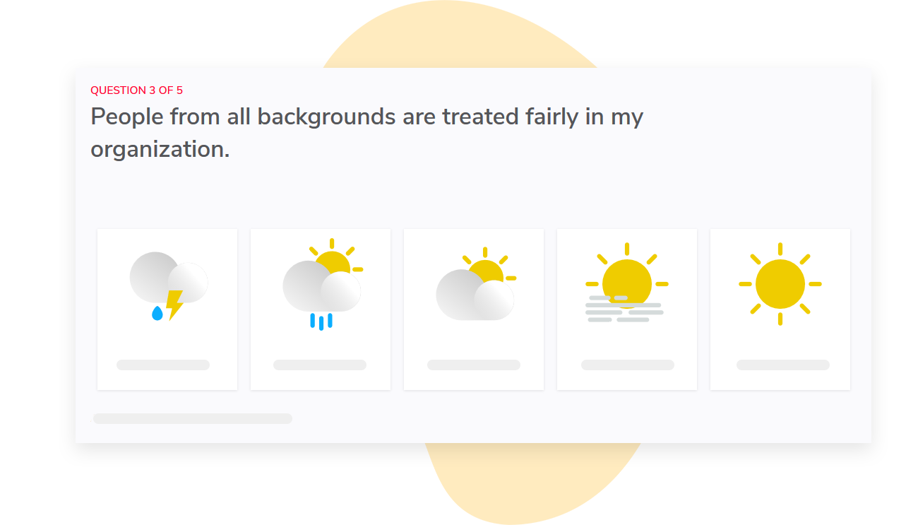
If you represent a large enterprise, the company average is probably not the most interesting number.
With Sparkbay, you can break down your results by manager, department, tenure, or other workforce groups using our platform. This way, you can distinguish a real organization-wide change from one division driving the average up or down.
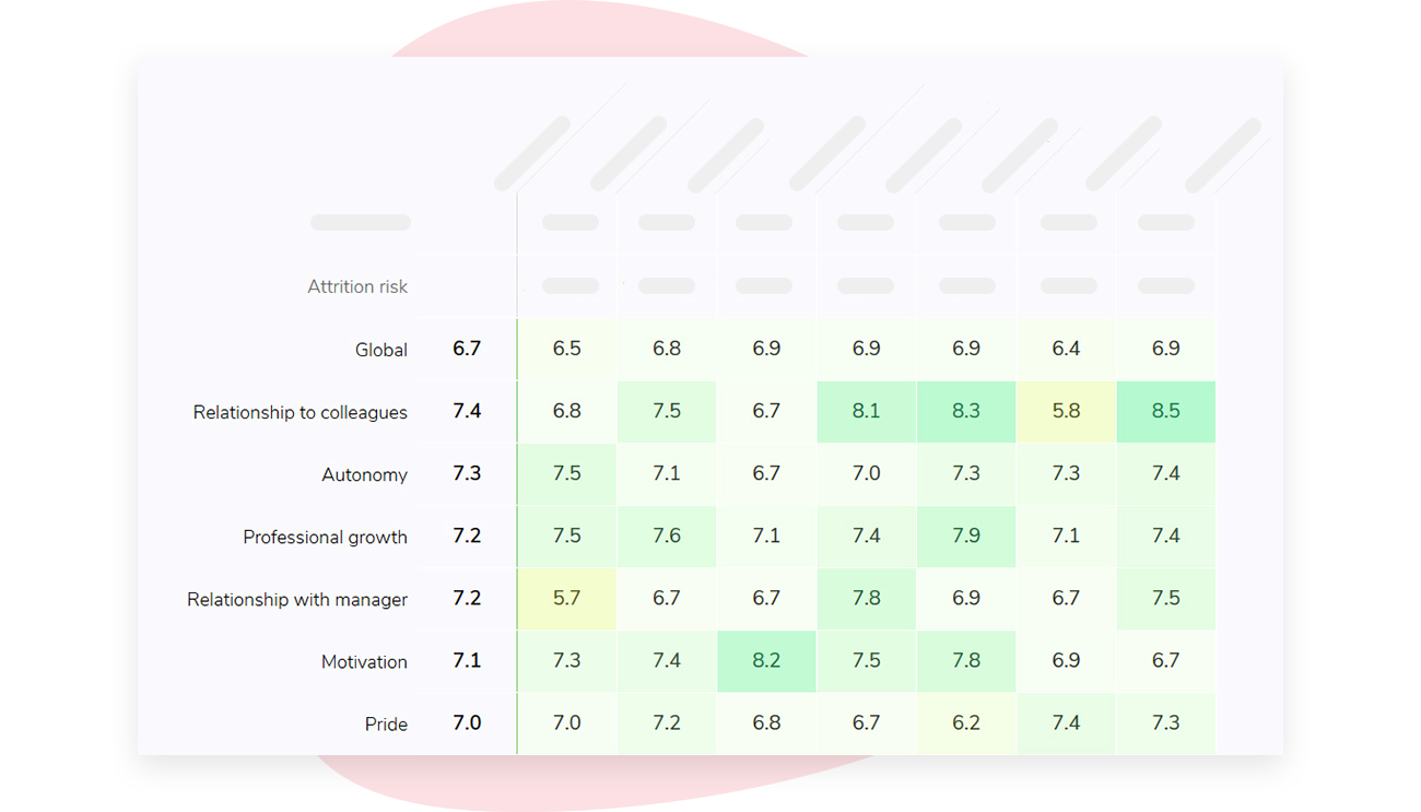
Sparkbay automatically matches access to your org hierarchy, so managers only see results for the teams they manage.
This ensures that your tool is adopted at every level of the organization.
We also hide results if the number of responses don't meet the threshold you set. By default, the minimum number of responses is 5, but you can change this number to fit your organization's needs.
Plus, Sparkbay's recognition and people-analytics views are available alongside your survey results.
This means if a weak driver is there, you can also see if it's linked to retention risk and take immediate action.
If you're interested in learning how Sparkbay can help you build a more engaged workforce, you can click here for a demo.
A practical blueprint for your employee engagement score
So what does this look like in practice?
If you're building your employee engagement score (or revising it) from scratch, you should:
First, select ~8-12 core survey items related to different aspects of engagement (e.g., employee advocacy, purpose, effort, retention intent). This should be a sufficient number of questions to produce a reliable measure, but limited enough that you can keep the weighting of these items consistent over a period of years.
Second, ensure that these selected survey questions are related to each other, but not so close in meaning that they're essentially synonyms for each other. This means checking inter-item correlation and factor analysis to confirm the overall construction of the scale.
Third, align your survey responses so that they're all on the same response scale (e.g., 1 to 5, 1 to 7). Keep the individual response data in its original scale, so your analytics team can understand how you converted the responses to a final number, and reproduce the engagement index independently if necessary.
Fourth, decide and document the weighting of each of these selected questions before looking at any survey data.
Fifth, calculate your engagement index only for respondents with a valid level of completed questions. Determine in advance how you'll handle missing data and whether you need to set any participation thresholds. Is there an adequate sample size for your specific group?
Will there be participation for all sub-groups? Should you exclude any groups due to low numbers?
Finally, once you've completed your survey, calculate your overall engagement score and individual dimension scores, and write up a report that includes these numbers. Consider what your strongest drivers of engagement are and include that in the report. And acknowledge the potential margin of uncertainty in the results.
Write down the methodology for creating the employee engagement score in a one-page methodology note. Include a version number, a named owner, and a change log for items such as: survey items included, survey item scale, weighting of survey items, participant eligibility rules, rules for handling missing data, and rules for suppressing results.
Invite stakeholders to participate in a review of the survey instrument, potentially with each engagement survey cycle, but definitely over a longer period than the survey cycle. This is because that survey instrument isn't designed to be a trend line. It's something you'll use over a number of years.
Generally, your core survey should change in response to:
- Changes in the construct being measured (e.g., a merger has created a significantly different organization)
- Your research suggests that a previously included survey item doesn't perform as expected
- There have been dramatic workforce changes that render the current survey items irrelevant
Simply wanting to generate a "better" number is not a sufficient justification for changing your core survey.
At the management level, you want to offer a clear explanation for why the overall employee engagement score is what it is (e.g., "here's why our organization's overall employee engagement score is 7.2"). You also want to provide an understanding of which groups have the largest gap compared to the average employee engagement score. Finally, you want to identify the "real" changes since the last survey or check-in.
Finally, since employee engagement metrics can easily become "vanity metrics" it's important not to tie accountability to the overall score generated from the survey. This undermines the integrity of the metric and leads to management of the measurement instead of management of the work environment.
If you're interested in learning how Sparkbay can help you build a more engaged workforce, you can click here for a demo.